A call to action is a term used in web design to entice a visitor on your site to perform something specific. The most common calls to action on webpages are in the form of clickable buttons. When the visitor clicks these buttons a predefined action takes place. CTA buttons should be added to every website design checklist.
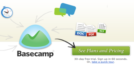
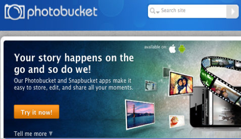
The most effective all to action buttons grab the visitors attention via design and text. Don't overly design the button. Often times colors such as green and orange are used in the design of CTA buttons. They evoke a certain click now and "go ahead" feel to the button. Many times when there is a free sign up or free download the button will be green. When it's an "Add to Shopping Cart" or "Try it Now" button, you'll tend to see the usage of orange. Also its important to use a language the visitor will understand. The context should be concise and clear on what action the visitor will be taking once they click the button. Here are few examples of some CTA Buttons with simple design and text:


An important part of designing CTA buttons that also goes along with the language of the button, is to consider what you're offering the visitor. Some good examples of how to phrase CTA buttons are:
- Learn More
- Free Download
- See Plans and Pricing
- Sign up for our Newsletter
- Add to Shopping Cart
- Try it Now
Here are some good examples of these buttons:


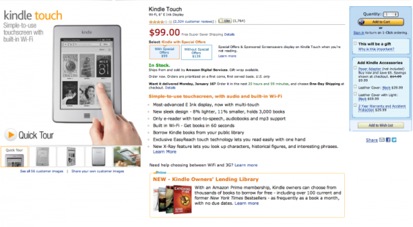
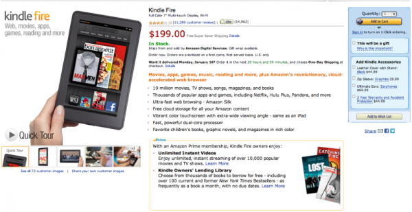
Consistency in design is important all around, even with call to action buttons. Make sure you're always placing the button in the same spot of a page if it appears on more than one page. When ordering a product on Amazon.com, no matter what the item is, the shopping cart call to action button always appears in the same spot.
Here's an example:
When designing your call to action buttons for your site it's good to keep in mind a few things: the language, design, and consistency of your buttons!