A landing page should engage a visitor and lure them into navigating deeper into your site. An ineffective landing page can put a damper on your leads and conversions and is often indicated by a high bounce rate which is the percentage of people who leave your site after viewing that page.
By making a few changes to your landing page design, you can improve your bounce rate in 7 easy steps!
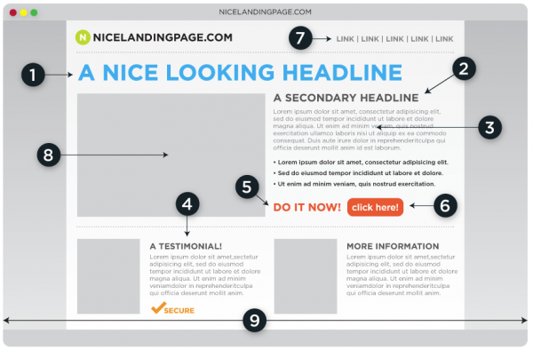
To begin, it's helpful to see how a landing page should be designed. Below is an example of a proper landing page framework:

And this is what it translates to:

Following and including the steps listed below are vital when designing your page:
1. Headlines and copy
- Headlines play one of the most crucial parts in conversion. Make your headlines clear, understandable and create some interest that draws visitors in. By following some guidelines when creating headlines and copy, you will be on your way to improving conversion rates.
2. Focus
- Pick a landing page topic and conversion goal and stay focused. Make sure you don't get caught up in trying to be everything to everyone all the time. It's confusing and dilutes the main message.
3. Be Visual
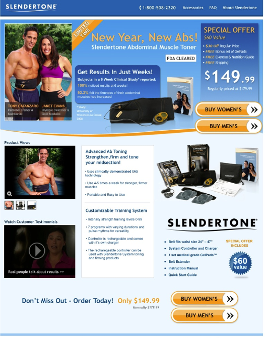
- Create infographics to show what lengthy copy might otherwise say, use imagery to draw people in. Include video testimonials, product shots in and out of the box, help visitors feel informed.
4. Grammar Check
- You have a very limited amount of time to make a positive impression and build trust. Don't turn people off with typos and bad grammar. This holds especially true for ecommerce landing pages.
5. Building Trust
- If you're asking for email addresses or personal information of any sort, make sure you let people know what you plan on doing with their information. If you have security badges for your online transactions, third party memberships or affiliations, include them on the page.
6. Strong Call-to-action
- Make it easy for visitors to take a next step on your site. Create a sense of urgency. Something such as "Download Now" works better than "Read our Interesting Article on Topic X".
7. Test
- Not sure the best wording for your Call to action? Never fear, A/B testing is your friend. Create duplicate landing pages and change one single element, you can test to see what works better. Don't spend time wondering and debating about something in the page design which can easily be tested, measured and evaluated. Put your ego aside, and see what works.
Now, go make the necessary changes to ensure that you have a well designed landing page that will result in an improved bounce rate!