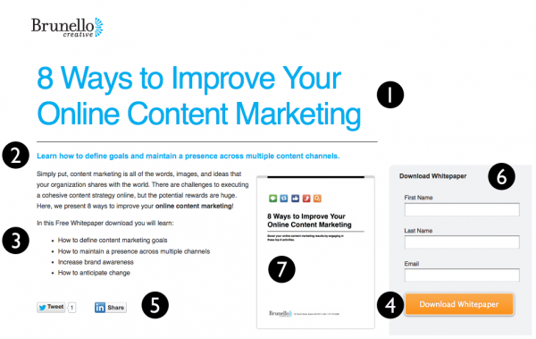
Here at Brunello we are no strangers to designing landing pages. A landing page is a page that asks the visitor to perform a specific task such as completing a purchase or subscribing to a blog. A poorly designed landing page will result in high bounce rates. Before you can begin designs, it is important to understand the anatomy of a landing page.
Properly designed landing pages always consist of:
1. A Headline
- Considering people's attention spans are short, your headline needs to be as clear as possible. It should also be powerful enough to entice the visitor to stay on the page. Be sure that it compliments the copy of the call to action and ad copy.
2. Secondary Headline
- Expands upon the main headline
3. Copy
- Explains the purpose in further detail of why the visitor is on the page and why they should download what you have to offer. Here, a bulleted list is a good way to keep the visitors attention and makes the information easy to digest.
4. A Call to Action
- Should compel the user to follow through with the desired action. Be clear and succinctly state what the users action will be when clicking the button.
5. Social Links
- If your visitor has decided to download your content, it's wise to encourage your new leads to share the landing page with their Facebook friends, followers on Twitter and their connections on LinkedIn!
6. Lead Capture Form
- This is an extremely important part of a landing page. This is where your visitors will provide their information in the exchange of what you have to offer. This is what converts visitors into leads. Keep the form simple by only asking the information you absolutely need.
- Consider directing the (now) lead to a thank you page after form submission.
7. Related Images
- Provide a relevant image on your landing page. Match the image to the offer. Images also make the landing page much more visually appealing.
Tip: For landing pages where the intention is for the visitor to complete a purchase, consider including a testimonial section on the page. This will help build trust!
Pro tip: Be sure to keep all landing page elements above the fold!
Here's one of our own examples:

With any kind of web design, there are always a few factors to consider:
1. Testing
- Make use of A/B testing. Create duplicate landing pages and change only one element. This will help you see which works better. Testing allows you to improve conversion rates.
2. Analytics
- Evaluate the results you are seeing. Refer to these metrics to see the overall effectiveness of your landing page design. Check your bounce rates, traffic and leads.
3. Promotion
- How are you getting people to your page? Have a game plan ready for your landing page promotion. Optimize your landing page with keywords so it'll get found. Share it on social sites and lead into it with a well written blog article of a related topic.
4. Consistency
- Throughout promotion, remember to keep all your messages consistent. The messages you use to promote should reflect the message of the landing page. You don't want to foul all of your hard work with inconsistent language!
Avoid high bounce rates and low conversion rates by making sure all of the above elements appear on your landing page!
Read our post "How to Improve Landing Page Design & Decrease Bounce Rates"! For more on this topic.