You know how it is, website registration forms can be both bothersome and problematic. These forms however are an important part of doing business and are extremely valuable to successful online marketing. With that in mind, as marketers and website designers, we must keep the intent of a registration form in mind, always.
The breakdown is simple, you want something from a user in exchange you offer them access to a community, whitepapers, downloads, the list goes on and on. If you ignore certain UX best practices, you will turn off your visitor and lose potential customer.
According to Forrester Research, "11% of US adults have previously abandoned an online purchase either because they didn't want to register online or the site they were visiting was asking for too much information".
When designing a sign-up form it's important that you:
- Keep it simple
- Expedite the process
- Eliminate any hesitation
Design a user friendly website registration through these easy steps!
Use copy to build value around registration
You need to entice the visitor to provide their information on the basis that they'll get something of value in return. Describe the benefits of registering via features and benefits statements that are easy to understand.
Avoid form field overload
The fewer form fields the better. Determine the minimum amount information that you need to do a follow-up with someone. The more information you ask, the more likely they are to abandon the sign-up process. Just like a landing page should only ask one action of users, only require they provide the most important and relevant information.
Make security and privacy policies clear
It is extremely important that you make your customers feel secure when they're providing personal information. Eliminate the fear of spam by ensuring that their information will not be given out, sold or abused in any way. Provide a link to your privacy policy along with indications of your site security.
Make password requirements secure but not complicated
Online security is extremely important so it is crucial that user passwords are secure. Try to maintain reasonable password security expectations. Make things too complicated and people will often forget their passwords, make things too easy and security could be breached. If possible, include a visual indication of their password strength.
Enable easy password recovery
Sometimes visitors forget they have registered on your site before. It is also likely they they will have forgotten what password they used when registering. Make sure you make it easy for them to obtain their usernames and passwords so they don't abandon your site completely.
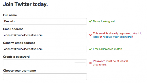
Clearly identify any form field errors
Mistakes are likely to occur when filling out forms. Show the user when there are mistakes as they happen, and explain the correct way to fill out the field.
Here is a good example of how you can show the mistakes and what the user needs to do to correct them:
Offer social sign-in
Also known as social authentication, allows visitors to sign into your site using networks such as Twitter or Facebook. This allows your visitors to register for your offer quicker and helps you gather more valid data about them.
Provide guest checkout option
Sometimes customers may not have the time to complete a full registration process. On ecommerce sites, offer the option of a guest checkout without registration. This will help to lead to more completed transactions while ensuring satisfied customers.
Be sure not to drive any potential leads or customers away by complicating the registration process. Start improving your online registration forms using the tips above and watch your registration conversions increase.